FBI Most Wanted Data Analysis
Collected and analyzed data from the FBI Most Wanted API and external CSV datasets to map fugitive locations and activity patterns. Built interactive Python visualizations to identify regional crime trends and correlations across states, while examining historical data to assess the FBI’s success rate at capturing fugitives over time.
Project Overview
For this project, I worked with the FBI Most Wanted API, the world_country_and_usa_states_latitude_and_longitude_values.csv file, and the FBI Most Wanted Wiki. My goal was to examine both current and former criminals on the list to identify trends and assess whether there’s any predictive value in the FBI’s success rate at capturing fugitives.
I took a different approach to this project than maybe was expected of me. I wanted my project to be interesting, not just random data. This required me to teach myself a lot of new things and read up on many Python libraries. When doing this, I used a lot of debugging, printing names and information to screen, to see why data wasn’t coming out how I wanted.
Technical Challenge
The Problem
One challenge I faced was how to plot each criminal accurately on the map. The FBI’s API has two versions: /v1 and /v1/list. Initially, I used /v1, which only returned the nationality of each criminal. This was a problem because my CSV file only included country names—not nationalities—with corresponding latitude and longitude values.
The Solution
I attempted an overly complex solution using several Python libraries to convert nationalities into countries. Later, while reviewing past coursework, I remembered the /v1/list endpoint. Although I assumed it returned the same data, I tried it anyway and discovered it included the country names directly, solving the problem entirely.
Data Visualizations
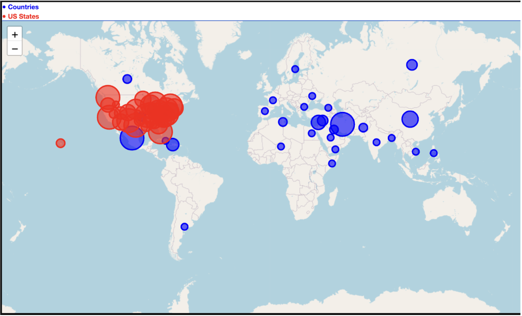
1. Interactive Geographic Distribution Map
Early on, I created an interactive Folium map displaying the current FBI Most Wanted list. I spent considerable time learning how to plot long/lat points on a map and found Folium to be the most effective tool. I was pleased with how the visualizations turned out.
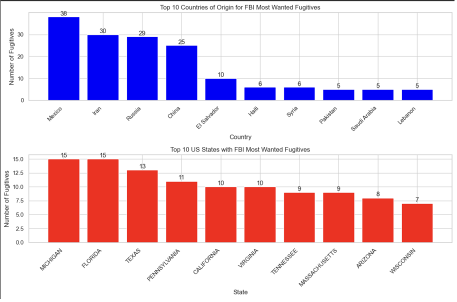
2. Fugitives by Country and U.S. State
I generated bar charts comparing the distribution of fugitives by country and U.S. state to identify geographic trends. I wanted to visualize this data as a bar chart with each state and country keeping their respective colors. Each country’s criminals were summed to create the final product.
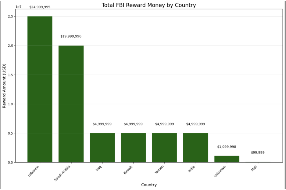
3. Total Bounty Value by Country
There are many countries that cause problems as seen on the map, but which country causes the most trouble overall? I saw that each person is given a bounty and figured that would be a great way to determine how much trouble each individual person is causing. By grouping them by country and summing their total worth, you can find that we have a lot of money put towards catching people in Lebanon.
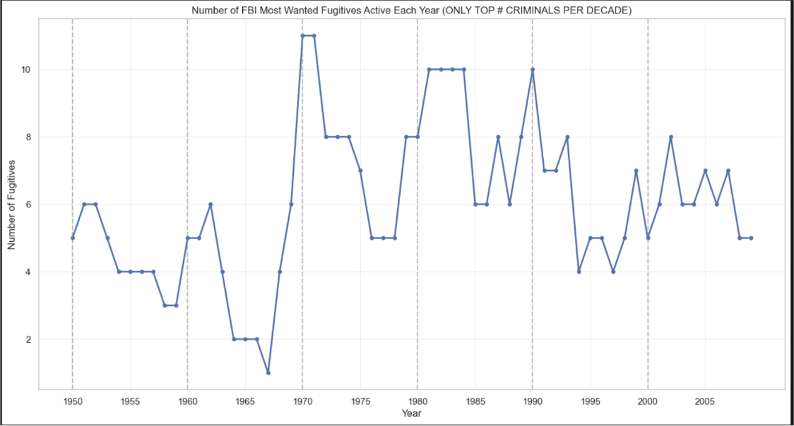
4. Historical FBI Most Wanted Timeline
Once I completed the current data analysis, I wanted to explore the history of the FBI’s Most Wanted list. However, the FBI does not publicly preserve a record of past fugitives—only the current list is available. Eventually, I found that Wikipedia had compiled sufficient historical data from 1950 to the present. I spent several days writing regex patterns and functions to extract and graph the historical fugitive data.
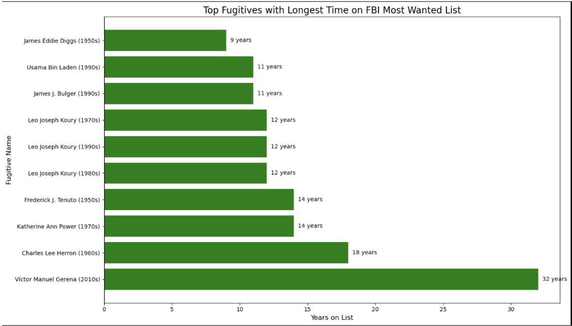
5. Number of Fugitives Wanted per Year
I created a graph representing the number of individuals wanted in a given year. For each year, I selected the three individuals who had been on the list the longest. I used the years they were added to the list and the years they were captured to fill in data points across the timeline. In this graph, a higher y-axis value reflects a worse year for the FBI, indicating that more fugitives remained at large.
Reflections & Future Improvements
To improve this project, I would focus on creating more visually appealing charts. In some ways, I wish there had been more criminals listed in the past, as that would have allowed for a more thorough analysis. I noticed that certain decades lacked sufficient data, so to ensure consistency, I chose the top three fugitives with the longest time on the list.
In the future, I’d be interested in applying this same methodology to a dataset with more consistent historical records, such as sports data, which would provide enough data points to draw more reliable conclusions. I believe my approach in this project is unique, as I couldn’t find much prior research that attempted what I did.
I’d like to share this project with future employers because it highlights my problem-solving skills, particularly in plotting country data by integrating a CSV file with API outputs, and in using web scraping to track historical data. Initially, I tried using the Wayback Machine to retrieve old FBI Most Wanted snapshots, but due to limited archives, I turned to Wikipedia, which ultimately provided exactly what I needed.
Most importantly: I spent 2 hours a day for 2 weeks on this and I had so much fun doing it. I enjoy the challenge of having no idea how to do something and needing to research and trial and error. Yes, I wanted to pull my hair out many times, but now that I look at it, I’m proud that it works—even if I didn’t get the outcome I originally wanted.